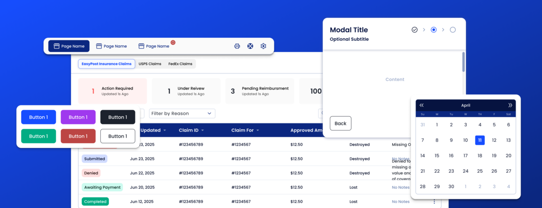
Easy.UI Design System
Defining the Future of UI at EasyPost
Deciding when starting from scratch is actually necessary
In 2023, I joined EasyPost as part of a new age for the company. They had not had a dedicated UX team in many years for the company had not invested in UI based experiences and the old leadership thought UX wasn’t needed for dev tooling.
Their UI was an afterthought, the workflows were clunky, but their underlying product was powerful.
My first few months with the company were filled with product audits and vision workshops with product leadership.
UX Audit Findings:
- EasyPost UI had 3 different eras of components and UI implementations. These carried significant tech debt that made sweeping changes impossible and small edits very difficult.
Solution Option 1: Net New System
Opportunity:
Will unlock faster development speeds and launch cohesive new experiences leveraging sharable components. Stronger first impression and immediate reduction of tech debt for net new products that were planned for development.
Risk:
Creating a completely new frontend infrastructure will have a large upfront cost. This would require a lot of engineering resources taken from feature work. Adoption would be technically challenging in the beginning to support both old and new pages. Ongoing adoption is a large unknown.
Investment:
Estimated at 1 quarter of engineering work for 3 developers before components could be leveraged. Then ongoing adoption speed unknown.
Solution Option 2: Rework an Existing Set of Components
Opportunity:
Will unlock faster development speeds and launch cohesive new experiences leveraging sharable components. Easier implementation into existing products for connection already exists and would not need to be built new.
Risk:
Current tech debt will require shared experiences and features to be built multiple times for each product and the current outdated look will be the first impression for the new market. While this would be partially addressed, it would be a slow process to do without breaking what is currently live. Additionally, the net new products may end up not getting the new visual treatment hurting first impression and would carry tech debt from the founding products.
Investment:
Estimated that UI improvements could be stood up in 1 month without layout changes. If a new component would push for a page layout change then the entire page would need all new components available at once.
Decision: Create New System
Why:
Product, Engineering, and Design leadership agreed that slowing down for 1 quarter to unlock a faster future would be best for the company's long term vision.
Establishing the Infrastructure of Easy.UI
What must Easy.UI get right to properly scale with EasyPost and drive user adoption.
At its heart, a design system walks the line between a suggestion and a rule set. Without enough hard guidelines, consistency is very hard to maintain. The system needs to be flexible to adapt to different user problems and support future needs, but if each feature makes drastic one off adjustments then the system falls apart.
We settled on 2 guiding rules:
1. Layouts Assume Opt In NOT Opt Out
Many of the user problems EasyPost was solving had scales of complexity and required data density to be presented. Components were built with both collapsed and expanded states. From the beginning, design and engineering were prepared for a “Simple” and a “Detailed” variant in the requirements.
2. Token Styling Must Support Multiple Themes and Modes
While not initially prioritized, theming quickly came up as an early requirement. This was much more of a conversation than just “light VS dark mode.” Tokens needed to be changed based on requirements to adapt to a portfolio of brand styling, accessibility and localization. This resulted in a layered theming approach. A component showed based on {mode, style} and both layers could be managed separately. A theme on a table could be “Dark Dense” or “Light Comfort”.
Balancing the EasyPost Brand with UI Best Practices
The colors, fonts and styling from the branding guide influenced the new UI, but did not lead it.
Token and Component Design:
EasyPost went through a very expensive rebrand in 2022. The design team spent many cycles working with leadership on overall esthetic and it took a while to gain leadership consensus. It was extremely important to me that Easy.UI was not caught in the same trap.
A lot of the base visual approach was influenced by the marketing styling for it already had leadership approval. What works great for a marketing site, does not always work for a data dense technical experience; which was unfortunately the case here.
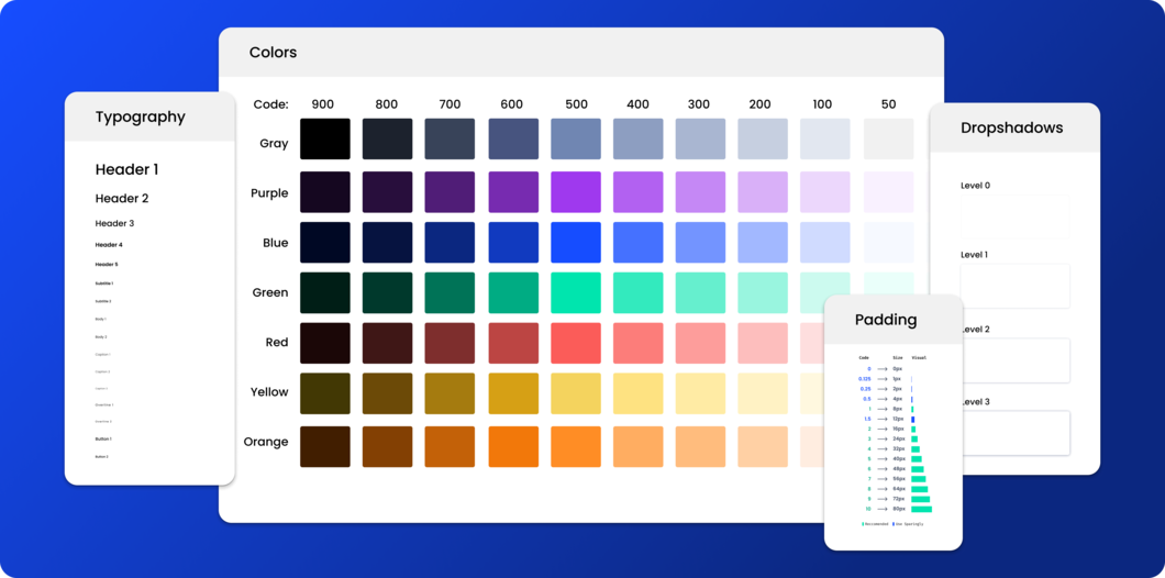
I expanded the color palette, changed the icon library, tweaked typography, and changed spacing standards. After many experiments, a balance between UI flexibility and maintaining the marketing “vibe” was found.
Driving Adoption with Iterative Releases
Creating a beautiful library of components is only useful if they are actually leveraged in the product.
A design system is ultimately an internal service for the other departments to leverage. When a completely new service is stood up in a vacuum, adoption can be a challenge. Engineering leadership needs to push their team to use the correct code base, developers need to see it as a better option than what they are currently doing, product needs to not see it as something that will slow down delivery speeds, and the design team needs to feel like it works for their work.
Luckily at EasyPost there was a lot of energy in making the product look more modern and a lot of new engineering hires were struggling with the older component library. However it was still a big choice for any scrum team to take on to be the “first.” Some plumbing would need to be taken on alongside just the frontend work to allow their product to handle both systems. The other option was a rip and replace, that would take too long.
Beginning Q2 2024 we had enough components operating that each feature being prioritized went through two checks.
1. Are all the components needed for the proposed flow built?
We wanted the engineers implementing the first rounds of integration to focus their time on the act of integrating with and using the system. Not contributing to it.
2. Is this project already redoing the entire screen or just a portion?
An entire page pointing to one component library was much easier to test, QA, and measure impact for than just one table on one page. It also didn’t make sense to try and force the team to completely rip out an old button and replace it with a new one (and all the integration required to do that) for just a change in copy.
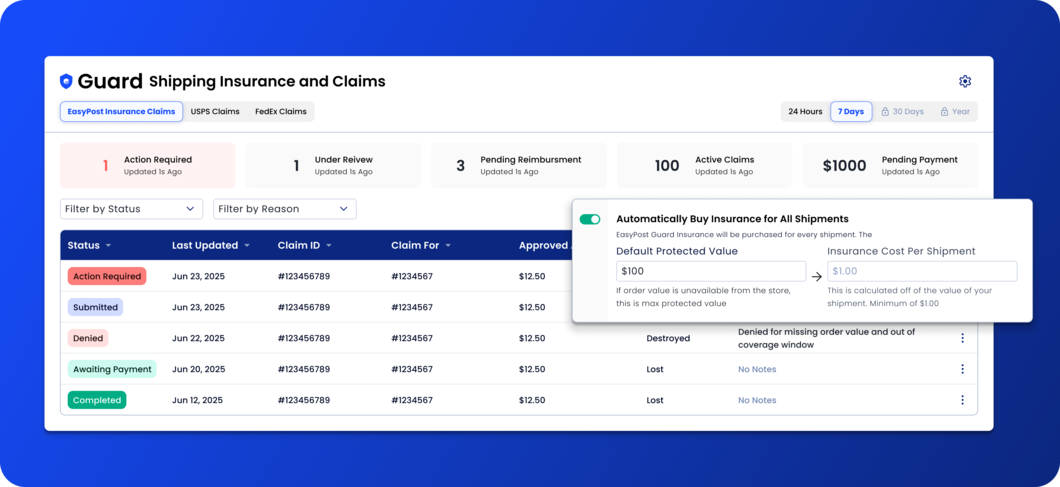
If both answers were yes, we set the expectation that the new Easy.UI library needed to be used. The first screens that got to use the new library were EasyPost Guard and EasyPost API onboarding.
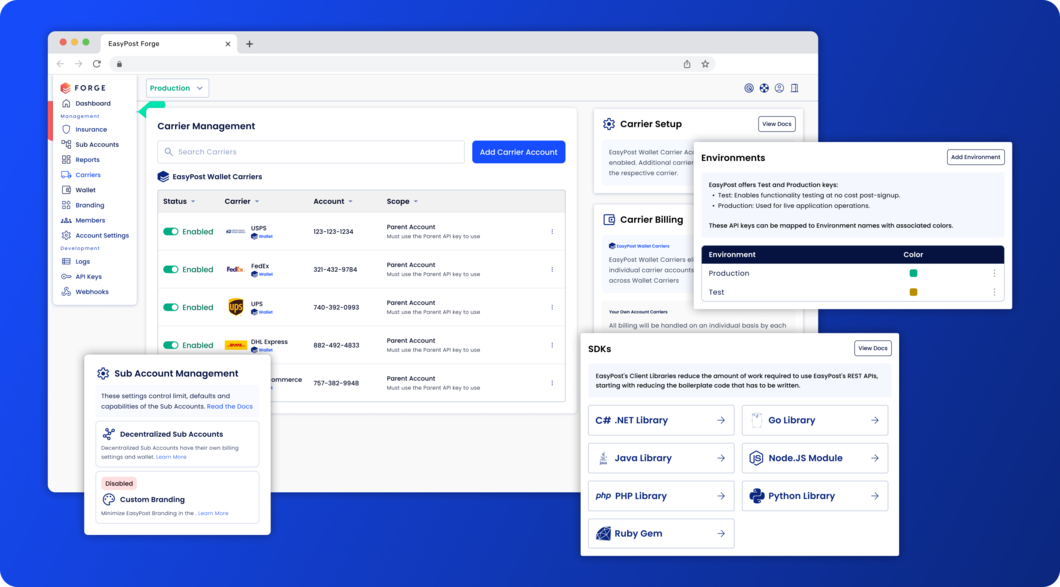
In Q1 2025 we stood up an entirely new product, Forge, within 1 quarter for the team was able to leverage the Easy.UI system for the front end and spend most of their efforts on new feature creation rather than UI layouts.
Success Metrics and Lessons Learned
The Wins:
I’m just gonna say it: launching Easy.UI was a huge success for EasyPost. The estimate of 1 quarter was a little off for it took 4 months to get the system to a place that could start to be leveraged. Once it was launched though frontend development got significantly faster. The frontend became a place of opportunity to experiment and drive growth for the company instead of just a UI for customers to use.
We saw a significant reduction in support tickets for Guard Insurance and onboarding related questions. Additionally, EasyPost saw faster training cycles of new engineers and the sales team routinely commented on improved demo sentiments.
What I Will Do Differently Next Time:
There are a couple things I would do differently.
It was longer than expected to get to the first full page leveraging the new design system. This created stress within company leadership about opportunity cost. After all, I had monopolized 3 engineers for 4 months and no product looked visually better or was benefiting from the work. If we were more behind, in reality this would have been a pretty large political issue for the UX team. Next time, I would be more aggressive about getting a screen out, no matter how small, using a new system sooner. There were opportunities on less used screens and smaller flows that were in flight during the earlier stages of the design system development that could have been used.
The other thing I would do differently is obviously the fact that the world has changed with AI assisted design. After launch we went back in and added many more rules and guidelines to better be leveraged by an AI assistant. Naming was an issue. What was a tile vs a card? A badge vs a label? These were all things that could have been better baked in from the beginning. It became a larger project than we wanted it to be to mature the AI’s ability to leverage the design system than we expected due to it not being very old.