CAT.app
Contractors Assisting Technology
Intro:
Admittedly, I was a little slow to the “vibe code an app” task that has taken the tech industry. I was enjoying learning how to use AI as part of my work at EasyPost. Later, I leveraged Replit and its integration with Figma to create the portfolio site you are on now.
In October of 2026, I finally had an idea of something I myself would actually want to use and not just a theoretical project. Throughout my career, I have done small side freelance/contract work alongside my main 9-5. Accurately tracking how long each project takes, remembering to send invoices every month, and customizing invoices to match my LLC are annoying at best. The option I was suggested long ago was QuickBooks, which is very advanced, expensive, and more than what I need. It was finally time to make vibe code something!
Day 1: Ideation
Tools: Figma Agent
Leveraging AI to help shape the vision.
I started in Figma, as a designer so often does, and gave the Figma agent a rough, shorter prompt of what I was imagining. I specifically asked for three low-fidelity versions because I wanted to stay high level and think through layout without getting distracted by color palettes.
It went as expected: not a failure, but nothing I wanted to run with.
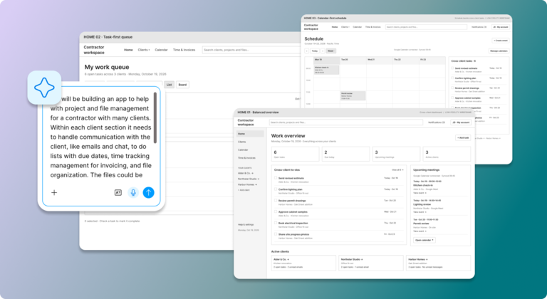
For the second round, I spent much longer on the prompt, and the results were much more interesting.
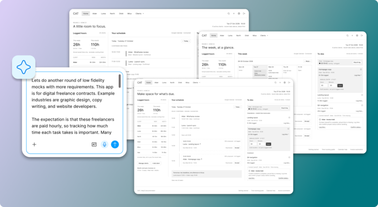
But in the end I decided to take about an hour and make a couple wireframes myself. Credit to the agent: it did do its job. I was able to create an actual prompt for the next round of wireframes. It helped me think through features and needs and actually direct possible layout and limitations for the app.
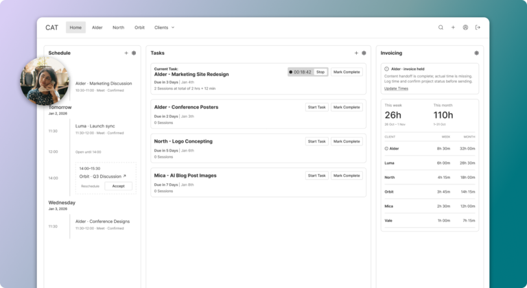
To be clear: I could have gone back and forth with the agent to get to what I ended up making myself. However, after a certain point, when does it make more sense to just do it myself and not spend the tokens? The initial ideation made by the agent most likely saved me at least an hour or two of playing around. Overall, this was faster and more efficient than my design process five years ago.
Moving From Low Fidelity to High Fidelity
I took my “final” wireframes and then asked Figma’s agent to mock up 3 high fidelity versions.
Seeing it in high fidelity highlighted some of the bad layout choices I was working with. I ended up revisiting the layout.
However, I noticed that each time Figma gave me the same 3 “styles” to go off of for the visual design. How did it choose these 3? Are they just the most popular from everyone else's work?
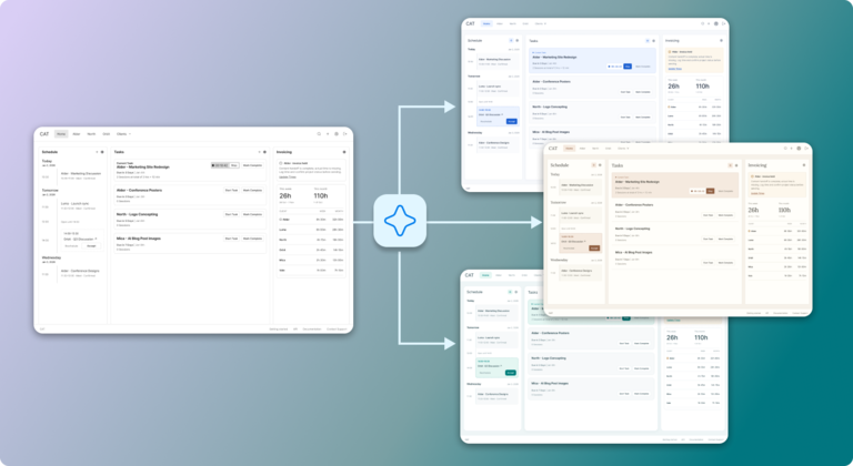
I was able to take one of them and after maybe another 30 minutes of adjustment, got to something that I liked more and felt more tailored to what I wanted. As in the first part, this cut down on the time I spent ideating but in the end I stepped in.
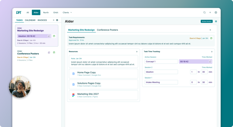
Creating the ToeBeansUI Specs with Figma Agent
Now this is when it got cool.
I gave my high fidelity mock to Figma’s agent and just said “make a component library based on it.”
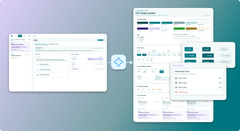
It was perfect and needed very little tweaking, done in less than 10 minutes. That alone would have taken me HOURS.
Day 2: Creating ToeBeans.ui System
Tools: Cursor, GitHub, and Figma
Creating V0.1 of ToeBeans.ui.
There are levels to creating a design system regardless of if it is going to be primarily used by AI Agents or humans. I have always been of the opinion that a design system should always be operating from the perspective of “bare minimum.” It must be complete, fully supported, and meet the needs of the products it serves. However, if a component is only a nice to have for one interaction when an already heavily used component would do just fine for the user, don’t build it.
So I started extremely small with the number of components created. No additional behavior documentation. No animation specs. Just tokens and components.
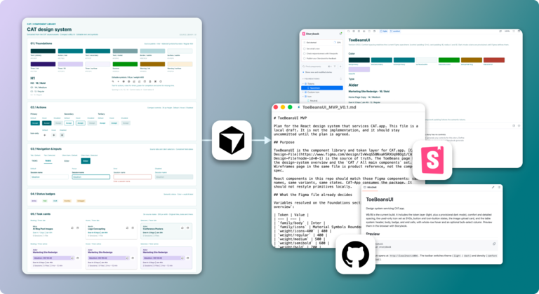
I prompted Cursor to draft a plan that used React components, supported versioning across different applications (not just CAT.app), laid the groundwork for density and color themes, and incorporated Storybook.
It took Cursor roughly 15 minutes to execute the plan and build off of the Figma requirements. It was honestly really well done but I did catch some mistakes in Storybook and through some follow-up prompts we had the 0.1 version of ToeBeansUI built.
Day 3: CAT.app Creation
Tools: Cursor, GitHub, VS Code and Figma
Using appPlan.md:
In the chat I rambled through the requirements I needed and linked to the Figma file where I had stood up some mocks. These mocks were a blend of my own mocks and mocks generated by Figma Agent. I had Cursor generate a base execution plan for initial app formation.
Based on the draft Cursor gave me, I spent a long time reading this plan and adjusting it. The key focus was proof of life. A Mac-native app with access to read desktop files, the concept of tasks and clients, connection to the ToeBeansUI system and basic interactions.
More work up front, but it used fewer credits and generated code faster.
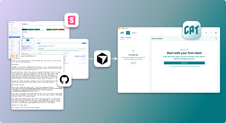
Blending additional featurePlans and chatting through improvements
As more features were added, I followed the same process for some of them: creating execution plans before implementation.
More was done faster, but over the course of the day it was hard to stay diligent in reading through and creating the plans. Eventually it turned into a very dynamic back and forth with Cursor in the chat.
More miscommunication happened this way, but the development speed was still fast. In the end this ended up wasting slightly more tokens than if I had been better with the plans, but not enough to be seen as a large process failure.
Key Takeaways
The burden of knowing what you want:
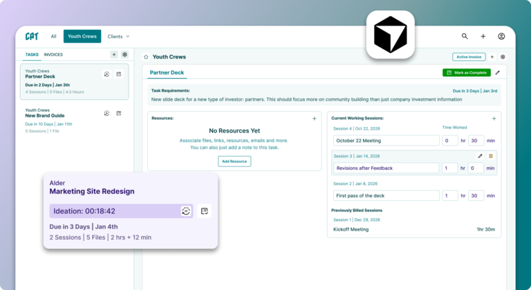
It took a while to get there, but still only took 3 days to build a fully operational application.
Every time I gave a new prompt, it was better. Seeing what it created helped me realize what I liked and didn’t like. In the first session, I hated all the low-fidelity mocks enough that I ended up experimenting myself the old-fashioned way. But in that hour as I worked, I was constantly trying different layouts and even though I ended up with just one mock, I probably iterated through at least 50.
For the AI, I have to specifically tell it to make 50 variants to pick from and each one is fully explored. I could tell while working that a layout wasn’t going to work, before I finished it, and pivoted.
If I knew exactly what I wanted in my mind’s eye, and could clearly articulate it in words, it could have been done instantly with Figma Make and Cursor, but in reality finding “product market fit” is just as difficult as before.
Finding the Balance Between Agent Work and Human Work:
You WILL run out of tokens eventually. What will you do then?
I spent $30 on Figma AI (after using the free tokens) and then $60 on Cursor tokens. I was doing some ‘last 5%’ adjustments when Cursor locked me out. Now if I am a business with dreams of building a new SaaS app, $90 is amazingly cheap.
But I did override the plan many times, spent time using my decade of experience to adjust the plans and the designs. Without that experience, or the knowledge of how to advise the agent and when to do things the old-fashioned way, it would have cost more.
Overall I am very excited about the AI powered future for SaaS, but where the balance lives for each task is something I am still experimenting with.